
The Fabric of our Society
The Fabric of Our Society column invites industry leaders to provide experience-based opinions and discussions on various topics. Diverse perspectives are respected and most welcome, but do not necessarily reflect the opinions of IESNYC or the Board of Managers. Want to contribute? Email [email protected]
August 2026
CRI Has One Job. That’s the Problem
 Jason Livingston
Principal, Studio T+L, LLC
Co-Chair, IES Color Committee
I was recently in what could have been a beautiful hotel bar. The interior was relatively new (about 10 years old) and skillfully conceived and executed. The materials were luxurious, and the lighting design should have been beautiful. But unfortunately, the overall look of the space was flat and dull. It didn’t take me long to figure out why: poor color rendering was muting the colors in the space.
I could tell that the SPD, while warm (I estimated 2400 K), was still deficient in red and probably had a CRI in the low 80s. The lighting designer probably relied on CRI, which just isn’t up to the job in this application. CRI only tells you one thing about a light source: fidelity, or how closely it matches the reference light source. This means the designer can have only one color rendering goal.
TM-30 supports a broad range of possibly overlapping color rendering goals. The lighting designer then balances the metrics, evaluating preference, vividness, and fidelity to achieve specific goals.
Starting with blue to make red
Most of us know that white light LEDs start with a blue LED as the “pump." Phosphors packed on top of the blue LED convert a large portion of that blue light to longer wavelengths. Converting high-energy, short-wavelength blue light to lower-energy, longer-wavelength light comes at the expense of efficacy. The more blue light converted to greens and yellows or (even worse) to red, the lower the LED’s lumens per watt. Since most manufacturers prize efficacy over color rendering, they skimp on red compared to the reference light source, resulting in low CRI. And the red-wavelength component is doubly valuable because it plays an outsized role in our overall color perception.
Figure 1 is a TM-30 report for a typical 80 CRI LED. At the top right hand corner, the P3 means the light source meets Priority Level 3 for Color Preference: it has been statistically shown to provide an acceptable level of user preference in general spaces. The source doesn’t increase the vividness of colors (V-), and the color rendering is not very close to its reference source (F-). In the graphic, the red arrows pointing toward the center of the circle indicate less energy in those color ranges than in the reference source. This results in the muting or graying of all object colors in that warm quadrant, including the different skin tones of the people in the room.
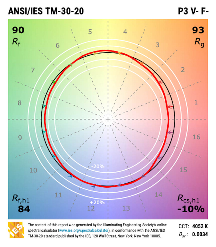
Figure 1 – TM-30 Simple Report for Typical 80 CRI LED: P3 V- F-
Figure 2 shows a typical 90 CRI LED. Even here, there’s slightly less red than in the reference light source. P2 indicates that it is broadly preferred over a high-CRI source. F2 indicates that it has good color fidelity overall.
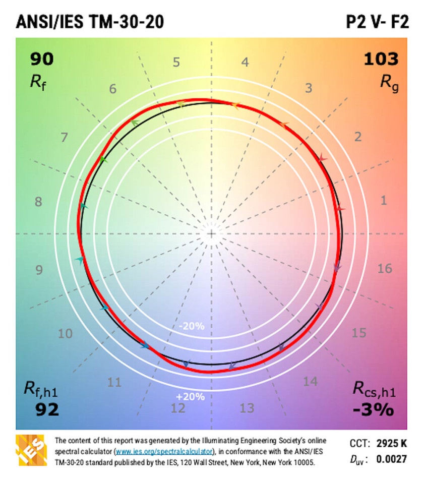
Figure 2 – TM-30 Simple Report for Typical 90 CRI LED: P3 V- F2
Use the tools
So, using a 90 CRI LED instead of an 80 CRI LED would improve things, and many designers and manufacturers are defaulting to 90 CRI these days. However, there’s another problem: the Hunt effect, which tells us that as illuminance decreases, so does perceived object colorfulness. The bar was lit to somewhere between 5 and 10 fc, so even under a high-CRI source the colors in the room would be muted compared to their appearance at, say, 50 fc. CRI leaves us powerless to do anything about this, but TM-30 gives us the tools.
Instead of looking for a high-CRI source, the designer could have used the PFV metrics from TM-30 to find a high-preference source, as shown in Figure 3. A light source that measures P1 (highly preferred compared to the reference source) has a spectrum that increases red saturation, which would enhance the colors of materials in a way that people prefer, versus your basic high-fidelity source – and possibly somewhat negate the dullness from the Hunt effect.
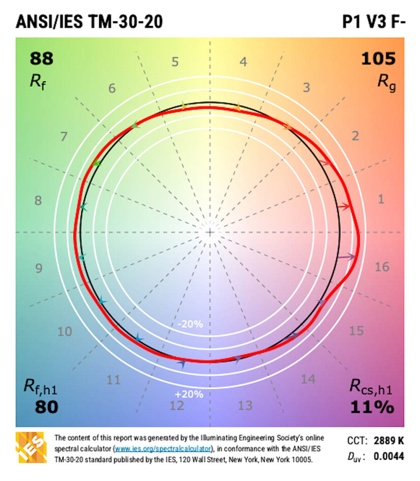
Figure 3 – TM-30 Simple Report for High Preference LED: P1 V3 F-
When countering the Hunt effect, a light source that increases the overall vividness of colors (a V3, for instance) might do an even better job of creating a vibrant scene where colors subtly pop rather than look flat. This is just one example of how switching to TM-30 and broadening your color rendering goals can enhance your lighting designs.
Don’t trade one-for-one
One final note: In January of 2025 the CIE recommended the lighting industry transition from CRI to TM-30’s Rf, which is a much more accurate measure of fidelity. My position, and that of the IES Color Committee, is it makes little sense to swap out one fidelity measure for another. We’d still be limited to a single goal. We’d like the industry to adopt the full TM-30 suite. Designers can ignore the 149 calculated values and instead focus on the PVF categories as I’ve done here.
For a full explanation of the color rendering goals possible with TM-30 and Preference, Vividness, and Fidelity, see ANSI/IES LP-30 Lighting Practice: A Comprehensive Guide to Specifying Color Rendition - Concepts, Criteria, and Implementation, available in the IES Webstore or the Lighting Library subscription. Despite its long title, it is easy to read. From project programming to DD to construction administration, this TM-30 user’s guide outlines the important color-quality considerations and how to incorporate them into your workflow.
2026 IESNYC Event and Educational Sponsors
Brilliant Sponsor

Radiant Sponsors


Glow Sponsors
Sparkle Sponsors
Lutron Electronics | Light Abilities
Twinkle Sponsors
Available Light | Hartranft Lighting Design | HLB Lighting Design
KGM Architectural Lighting | MGE Lighting Design Collaborative | Pierce Lighting Studio
