The Fabric of our Society
The Fabric of Our Society column invites industry leaders to provide experience-based opinions and discussions on various topics. Diverse perspectives are respected and most welcome, but do not necessarily reflect the opinions of IESNYC or the Board of Managers. Want to contribute? Email [email protected]
December 2025
From Bauhaus to Butter Cows:
Must We Choose a Color of Light?
 Scott Rosenfeld
Lighting Designer
Smithsonian American Art Museum and Renwick Gallery
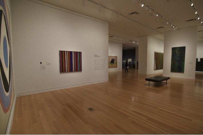
A standard practice for selecting a lighting source is to first select the color of light (CCT) and then to select color rendering attributes that meet the needs of a particular application. When the Smithsonian American Art Museum had the opportunity to replace our incandescent lighting with LEDs, I jumped at the chance to get color tunable fixtures that produced excellent color fidelity at warm and cool CCTs. The decision wasn’t without its tradeoffs, however. Multi-chip luminaires can create color variations within the beam, color consistency fixture-to-fixture can be a problem, and color tuning just isn’t available for the thousands of 4° fixtures we rely upon for precision spotlighting.
Still, being able to vary the color of light can help tell stories, and storytelling is central to my mission as a museum lighting designer. After using tunable-white luminaires for a few years, I find they’ve performed well illuminating our museum’s walls, floors, and large works of art. Tunable-white lets me balance electric light with daylight, create more dynamic visitor pathways by adjusting color temperature to match content, and tune light to reveal the warmth of wooden floors in contrast to the cool, crisp white of the gallery walls.
I value this flexibility, and that’s the key. Actively shifting and contrasting CCTs and colored finishes in the field of view lets us create dynamic experiences. It’s important to say up front: I don’t believe there is any single “right” color of white light for an application. The whole notion of a “correct color of light” seems built on quicksand.
I’ve been asking myself
When we turn the knob to make a high-quality spotlight warmer or cooler and notice the scene shift in appearance; are we really selecting a color of light, or are we just noticing the contrast between different colors? Giving it time helps, since our visual system tends to white-balance (chromatically adapt) to new lighting conditions quickly, usually within a minute or two. After we’ve adapted to a new color of light, most (though not all) colored objects will appear the same, regardless of the light’s color temperature. Right?
This phenomenon is called color constancy, similar to white balance on a camera. Still, while I know that color constancy explains how the eye compensates for light spectra, it feels counterintuitive, perhaps for good reason.
Esteemed color scientists, including Roy Berns, suggest that “most colors” are color-inconstant: meaning that the eye’s chromatic adaptation isn’t 100% and changing the spectrum of light will still impact colored finishes even when we’re completely adapted. I am 30+ years in lighting design, and I don’t know how to reconcile what appears to be a disagreement between color scientists and lighting scientists.
Perhaps it's because lighting scientists focus more on criteria for selecting lighting sources and color scientists focus more on the constancy of appearance of selected colors under multifarious lighting conditions.
The lighting scientists who created TM-30 certainly did wonders for helping us select among different lighting sources with the same CCT but different spectral characteristics. But selecting a CCT in the first place is another kettle of fish. My goal is to do a better job selecting between the infinite variety of different colors of “white” light, so I can confidently serve the artists and visitors in our museums as well as possible. This article is the best I can do to reconcile my understanding of the science with my experience working in the field.
Our visual system is wack: notes from the field
Demonstrating the power of chromatic adaptation is as easy as noticing how colored materials change as we move suddenly from daylight to warmer interior light. My favorite example is when I walk from my museum’s photography studio’s color proofing lab, illuminated at 5000K, directly into an exhibit lit at 3000K. At first, the exhibit looks intensely yellow; but after about a minute of adaptation, the 3000K begins to look white again.
I actually have a lot of faith in chromatic adaptation when the light source is hidden and we are just seeing the objects within a scene. However, I think it's a different story when I have a direct view of a luminaire. This is contradictory to what light scientists’ have taught me – but when I look at a string of white holiday lights, for example, I feel that I can intuit the color of light. Museums leverage this phenomena when we use well-baffled light fixtures that direct light onto displays while shielding visitors from the source.
Still, we can all confidently say that our visual system is wack, influenced by the interaction of colors in the surrounding view and our tendency to chromatically adapt. And because our visual system is so fickle, I am grateful for my spectrometer that lets me know the actual spectral characteristics of my lights. It’s like having a compass.
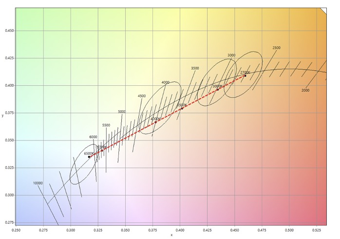
Typical white-tuning LED module that uses two different color LEDs; one at 2700K and one at 6500K; this arrangement allows different CCTs to be mixed along the line that connects these two CCTs.
My trusty spectrometer
In my years of lighting art museums, my understanding of light and color is challenged, often. My favorite example was when I installed my very first set of color-tuning LED fixtures on pristine white walls. I could have selected any color of light, but I was busy, so I dialed it in at 3000K. I was satisfied with the results, and got back to work, aiming, tuning, and integrating our fancy new Bluetooth controls. The result looked great, and the lighting was approved by everyone from the curator to the art conservators.
But the day my new spectrometer arrived, I was in for a surprise. I discovered that the control panel that displayed 3000K was off… way off! I am not sure if it was the optics, the lenses, or the control system – but the light everyone loved so much was 2600K; a CCT that is much warmer than is typically recommended for contemporary art.
Contemporary galleries illuminated at 2600K with a Duv of -.0035.
The museum subsequently renovated this wing, and the current lighting is at 3000K.
The good news for me was that the light was slightly pink, with a -.0035 Duv (shifted just below the blackbody locus), and in laboratory conditions people often prefer pink light for dimly illuminated fine art. It was also significant that the entire gallery was illuminated at 2600K. So without a reference, there was no way for me or anyone else to visually notice that the color temperature was “off.” I am a little embarrassed by this story, even though I was just literally caught being human with a human’s visual system. Our eyes are not spectrometers.
It’s an important story to tell, though, because I’ve seen many museum designers drive themselves crazy searching for the “perfect” color temperature. If there’s a significant amount of daylight, perhaps this is a noble endeavor.
Sidenote: As it turned out, the LEDs in that first batch of color-tunable luminaires ultimately needed to be replaced – not because they were reporting the wrong color, but because they failed in a much more important aspect. They didn't meet the manufacturer's specification for color tolerance between lighting fixtures. While we may not be able to know the color temperature without a meter, people can easily distinguish color contrast in a museum with white walls. When it’s intentional, great. But completely random color differences look like a careless retrofit.
Enter the butter cow
This summer (with much more tunable-white experience under my belt), I used tunable luminaires to light the Smithsonian’s butter cow at the Renwick Gallery. For this exhibition, we turned the entire building over to craft artists who had shown their work at state fairs around the country. Our goal was to re-create the feeling of a day at the fair. Alongside small, elegant works of art, we showcased pieces that were huge, bright, sparkly, and featured moving light and color.
Still, the butter cow (displayed inside a giant refrigerator) stole the show. Sculptor Sara Pratt and her daughters used 750 pounds of butter to create a life-sized Jersey cow. To illuminate it, I specified track lights on both the ceiling and the floor of the refrigerator, with tunable options ranging from 2700K to 6500K. Who would have guessed that this monochromatic condiment would become a perfect demonstration of the power of color-tunable light.
My initial plan was to illuminate the butter cow at 2700K to emphasize the yellowness of the butter. However, 2700K didn’t quite achieve the effect I’d hoped for. While talking with the artist about the color of butter (the butter she uses has no artificial colorants), she mentioned she wanted the cow to appear as naturalistic as possible, and even more yellow.
The solution came to me thanks to a recent conversation with one of the artist’s assistants, Hannah Pratt, discussing the artist and color theorist Josef Albers. Albers, had taught at the Bauhaus until it was closed by the Nazis in 1933, and is best known for his seminal work The Interaction of Color. In it, Albers provides dozens of examples of how people don’t see color as absolute, but in relation to surrounding colors.
What makes butter look yellow?
With Albers in mind, I experimented: I set half of the lights on the butter cow to 6500K. The cool illumination created a subtle countershading that, in turn, made the 2700K lighting appear even warmer. The combination enhanced the yellowness of the butter and gave the sculpture a dynamic, dimensional quality that delighted the artist.
The LED revolution has empowered us with the capacity to deploy colors of light in ways we couldn’t imagine; the interaction of color holds deep and robust possibilities for creating environments and telling stories.
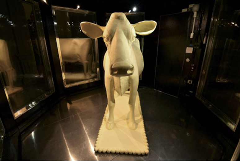
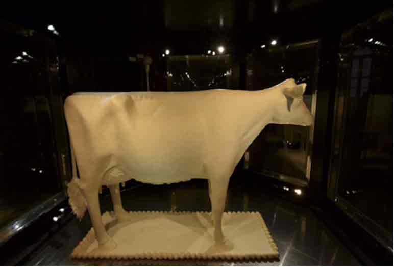
The final result was balanced up-down with the right flank of the cow (your left)
lighted with warm light and the left flank is cooler.
So, when you’re out in the field working with light, contrast is everything. I encourage you to let go of the idea that there is a single “right” color of light. A good designer can make a wide variety of color temperatures work in the same scene. Go ahead and question the typical advice of 2700K for hospitality and 3500K for offices. Work with intention, if creating warmth or coolness is important: be bold and artfully combine different CCTs. White-tuning LEDs allow the designer to make decisions in situ, and finesse the interaction of color from both the lighting sources and how the color of light impacts the interiors.
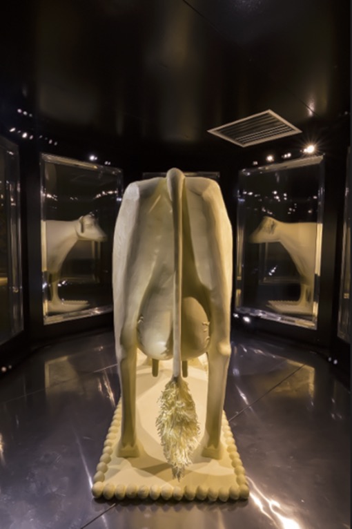
Exit the Butter Cow, the best view to note the contrasting colors.
Sources:
Berns, Roy S. Color Science and the Visual Arts. The Getty Conservation Institute, 2016.
Boyce, Peter R. Human Factors in Lighting, Third Edition. 3rd ed. CRC Press, 2014.
2026 IESNYC Event and Educational Sponsors
Brilliant Sponsor

Radiant Sponsors
Glow Sponsors
Sparkle Sponsors
Lutron Electronics | Light Abilities
Twinkle Sponsors
Available Light | Hartranft Lighting Design | HLB Lighting Design
KGM Architectural Lighting | MGE Lighting Design Collaborative | Pierce Lighting Studio